An analysis of Eirgrid electricity data
Ireland's electricity transmission system operator Eirgrid has a set of data dashboards available that display various information from the electricity grid. The information available includes things like electricity supply and demand, the amount of electricity generated by wind energy and the net flow on Ireland's interconnectors among other data. By inspecting the HTTP requests that these dashboards make I determined where the data was being pulled in from and proceeded to send some requests for myself.
For most of the data areas there is historical data available for the previous several years at 15 minute intervals. I wrote some code to request all data available for some of the provided information streams for the last 5 years. I collected the retrieved data into PySpark dataframes and then did some analysis on the distribution of each statistic over various time slices (hourly, monthly, yearly). This is my first attempt at using PySpark and my initial impression is that the syntax is a bit clunky (in comparison with pandas).
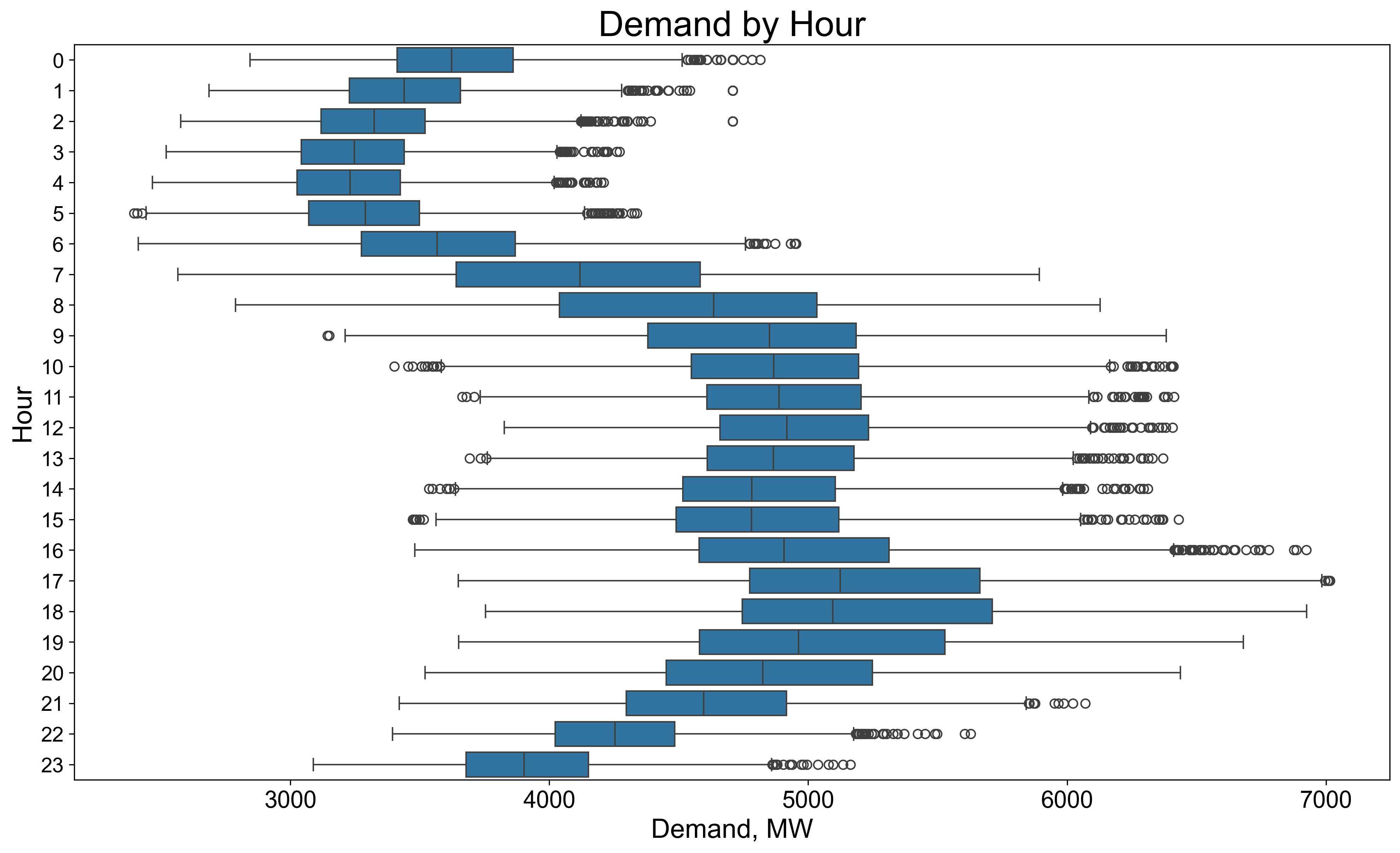
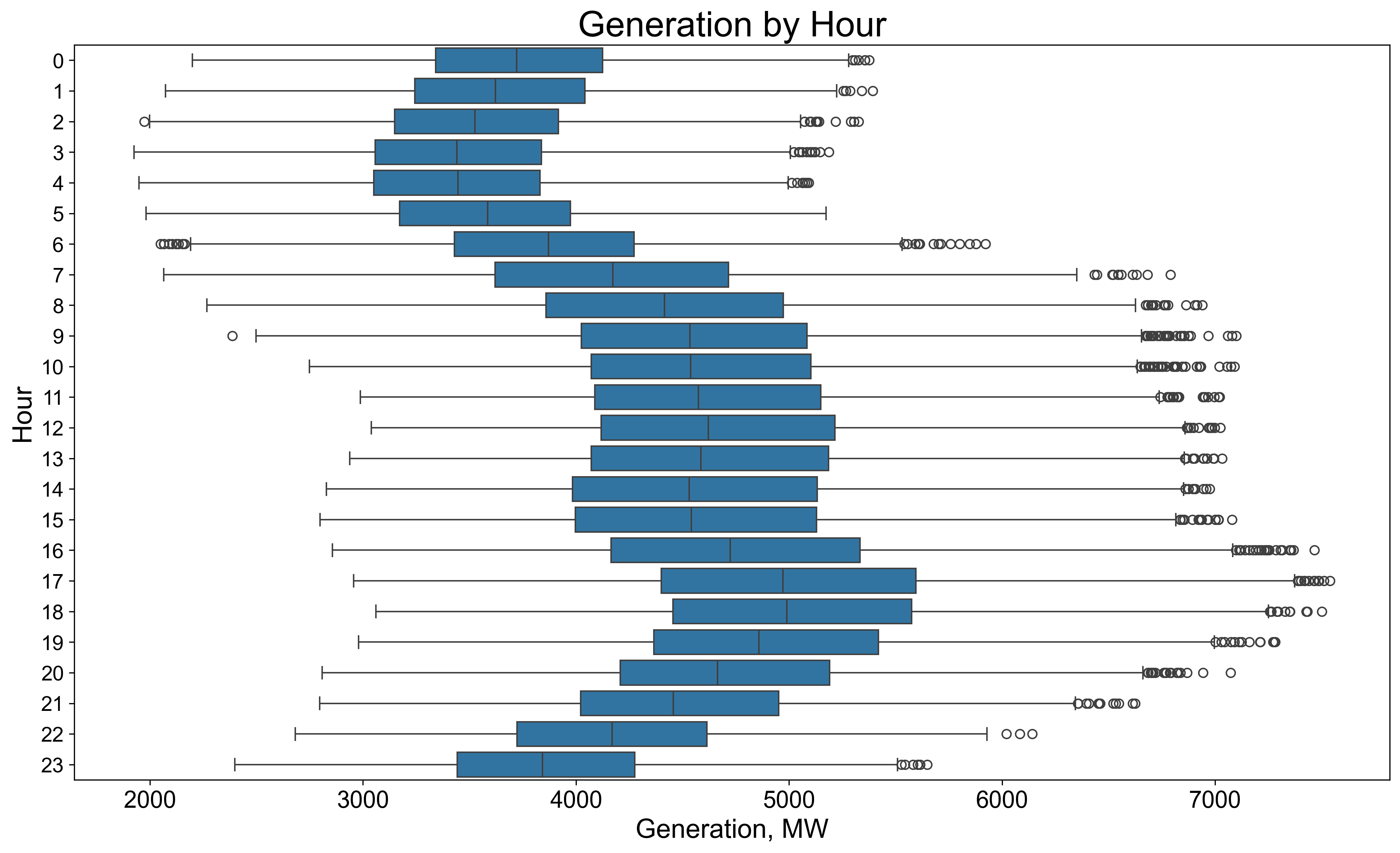
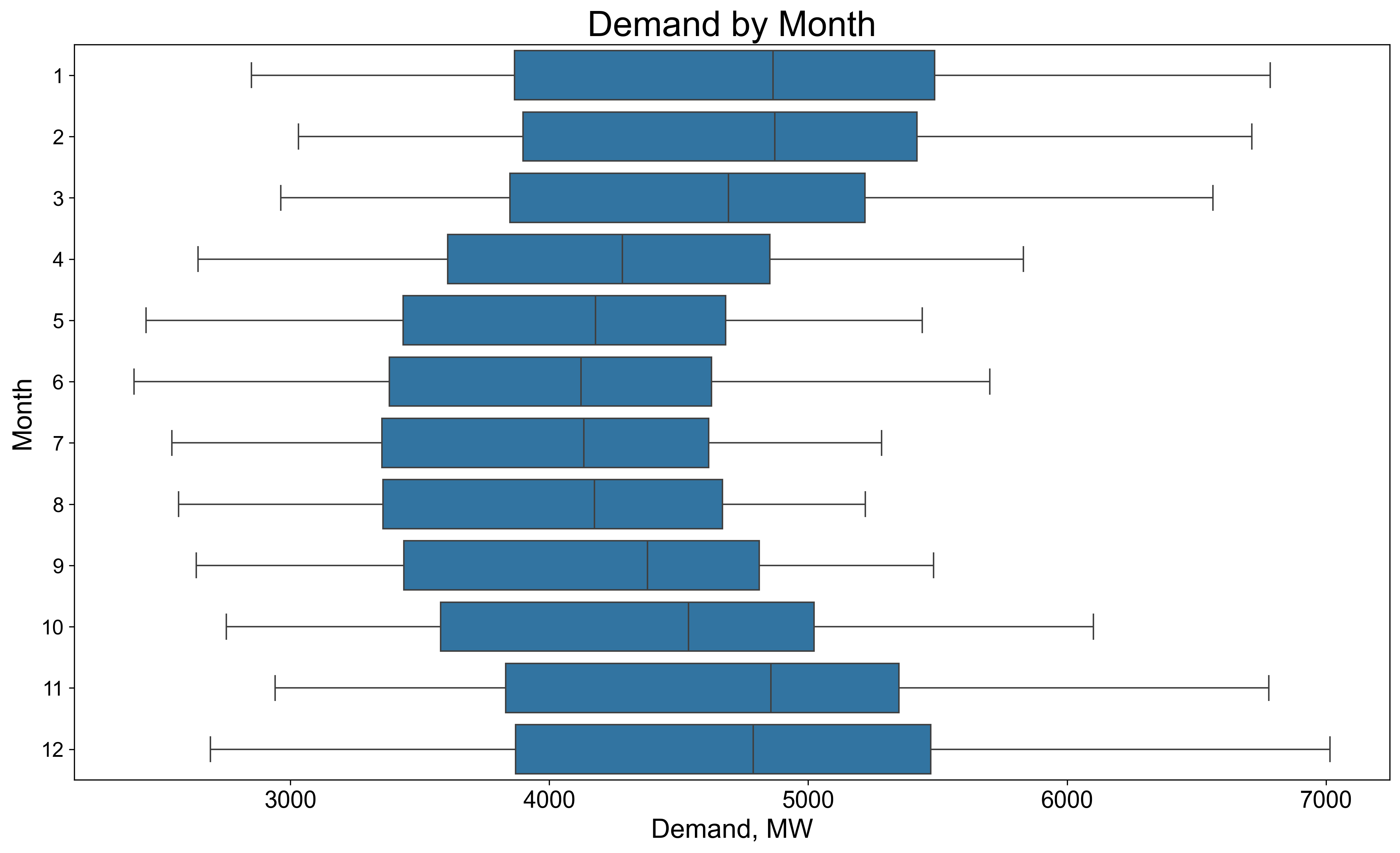
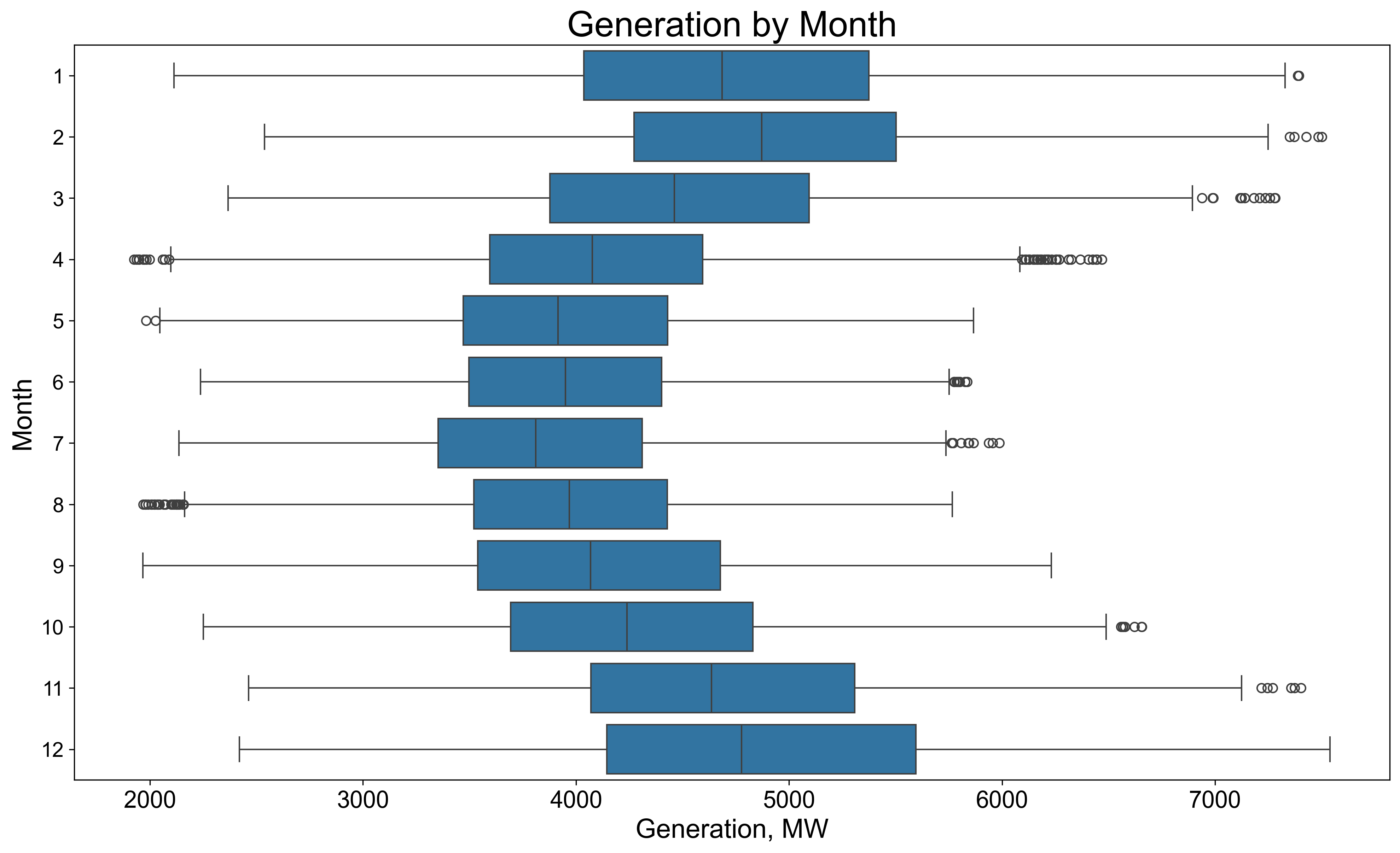
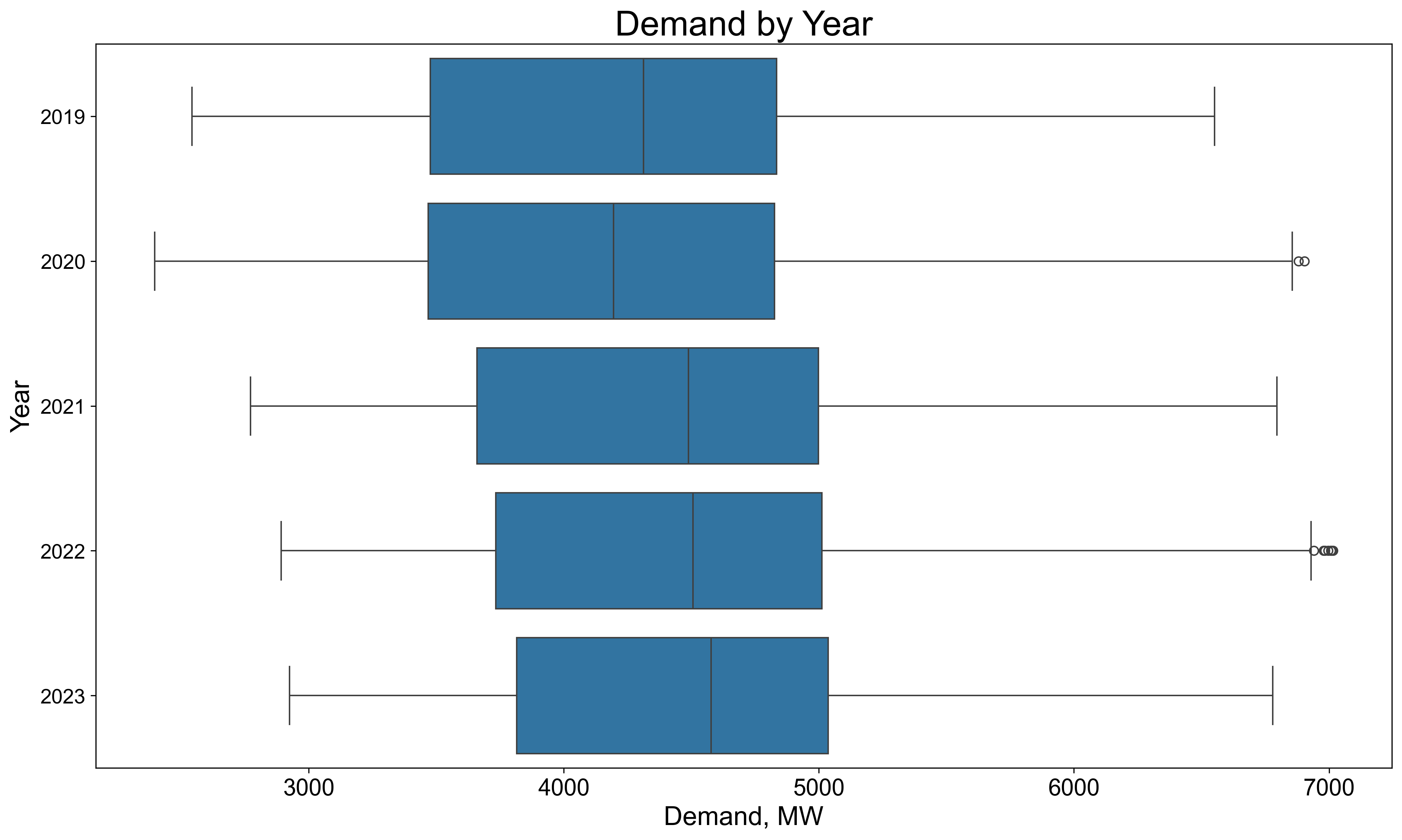

In the panel of boxplots above we are comparing the distributions of electricity demand (left column) to those of electricity generation (right column) split by hour (top row), month (middle row) and year (bottom row). We can see the variation in hourly demand and generation where the highest medians occur between 17-20 hours period. We can also see the monthly variation of electricity demand and generation with larger demand in the winter months. The most obvious mismatch in demand and generation occurs in year 2023 where the median demand is above 4.5 GW while the median generation is only just above 4 GW. This shortfall is made up with net interconnector inflows of electricity (The electricity grid on the island of Ireland currently has two 500MW interconnectors with the British electricity grid).
We can also look at the wind generation and CO2 intensity of the electricity produced:

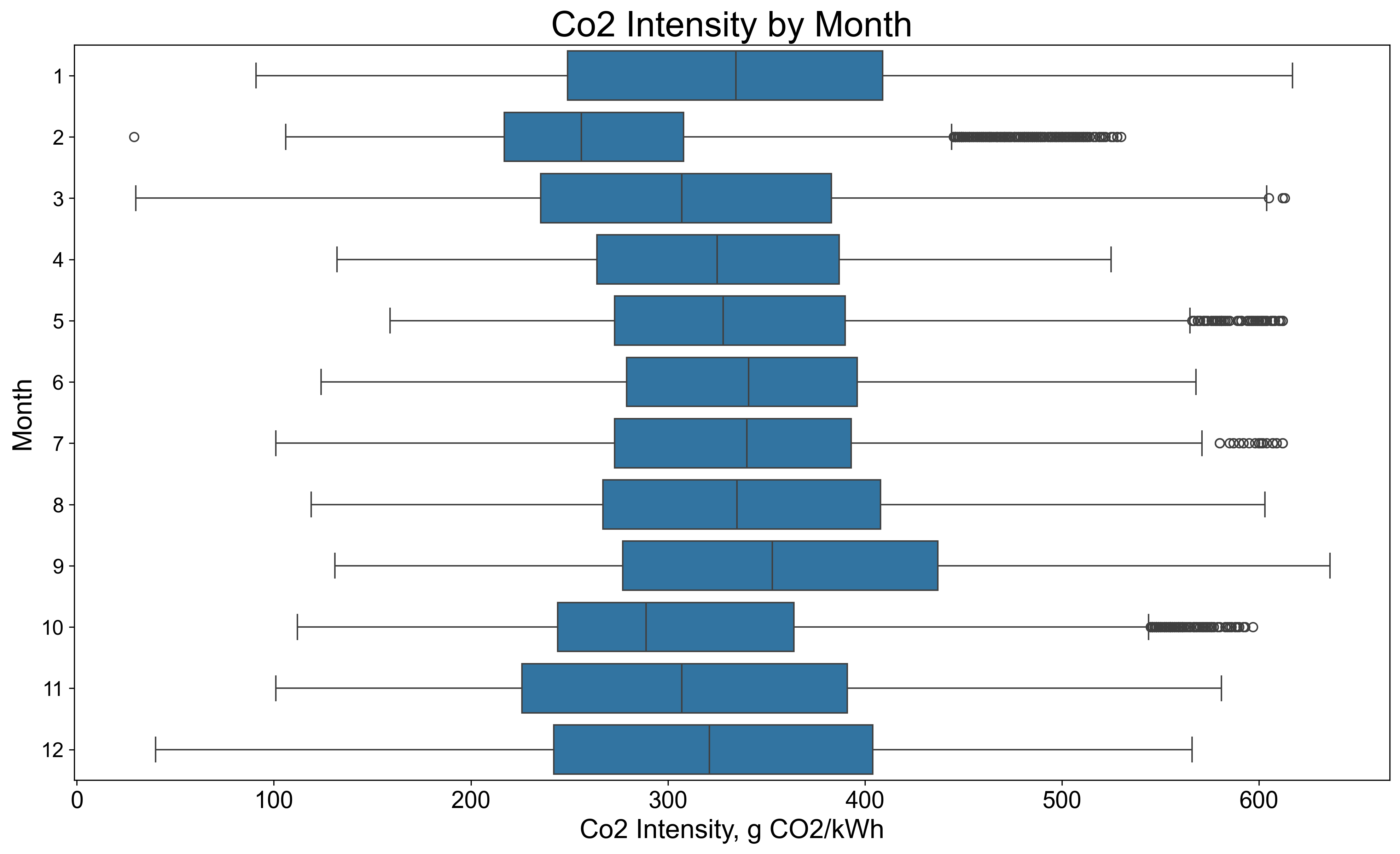
In the two figures above we are looking at the distributions of the electricity generated from wind split by month and the CO2 intensities by month. In the first of these plots we can see that there is, unsurprisingly, less wind energy produced in the April-September period compared to the October-March period. We can see this partly translate into lower CO2 intensity of electricity during the windier months in the second plot.
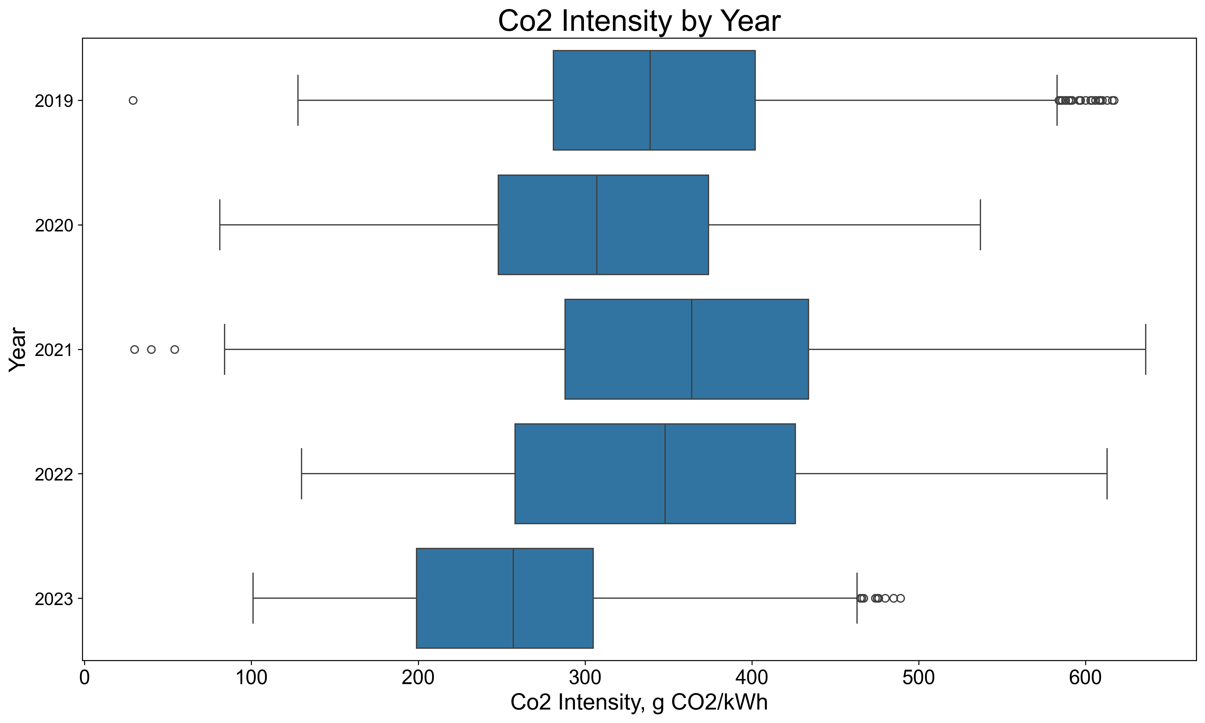
In the plot above we can see the distribution of CO2 intensities by year with 2023 having a considerably lower median CO2 intensity than previous years.
If you are interested in seeing how this was done the code for this project is available on my GitHub here