Determining the Golden Age of The Simpsons
This is a small project I carried out to look at the ratings of episodes of The Simpsons tv show over time using the average episode ratings from IMDB. I also looked at the distributions of ratings for selected episodes. On IMDB users can rate episodes from 1 to 10. The average rating for each episode is calculated from the inputted user ratings using a weighted average approach involving IMDB taking proactive steps to give as accurate an average as possible.
The summary information of the episodes were obtained using the python requests package and the html was parsed using the Beautiful Soup package. This allowed me to identify the peak period of the show (see image below).
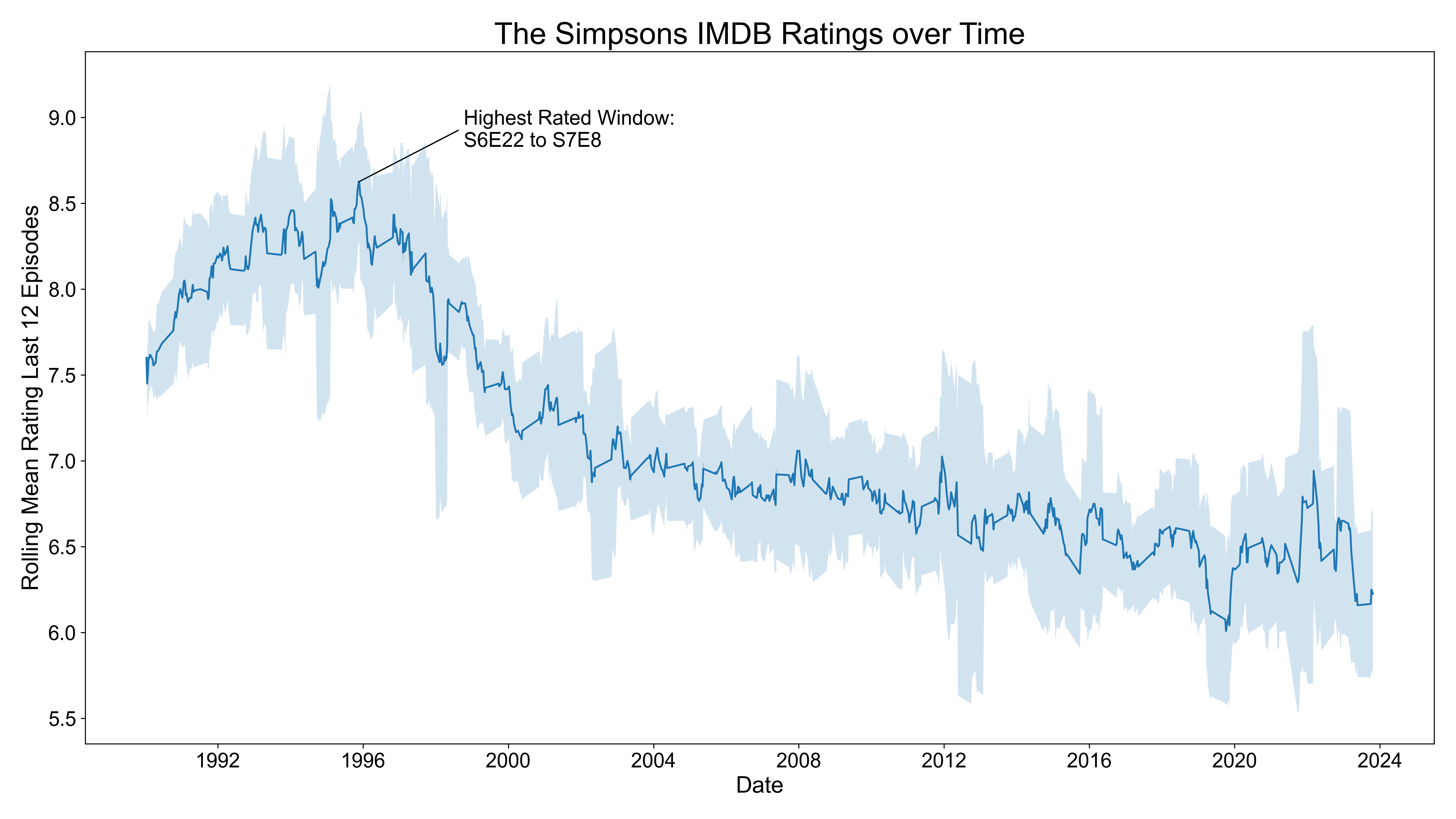
In this figure I have calculated the rolling mean of the average episode rating in 12 episode windows (around half of a typical 24 episode season). This has been plotted over time from the start of the tv show in 1989 up until the most recently aired episode (22nd October 2023) and is indicated by the solid blue line. The shaded regions represent plus and minus one standard deviation from the average ratings within the 12 episode window that the rolling mean is calculated from. The peak 12 episode window is from S6E22 to S7E8 (the individual episodes in this window are shown further down the page). It is also apparent the degree to which the ratings of the TV series have declined from the late 1990s onwards.
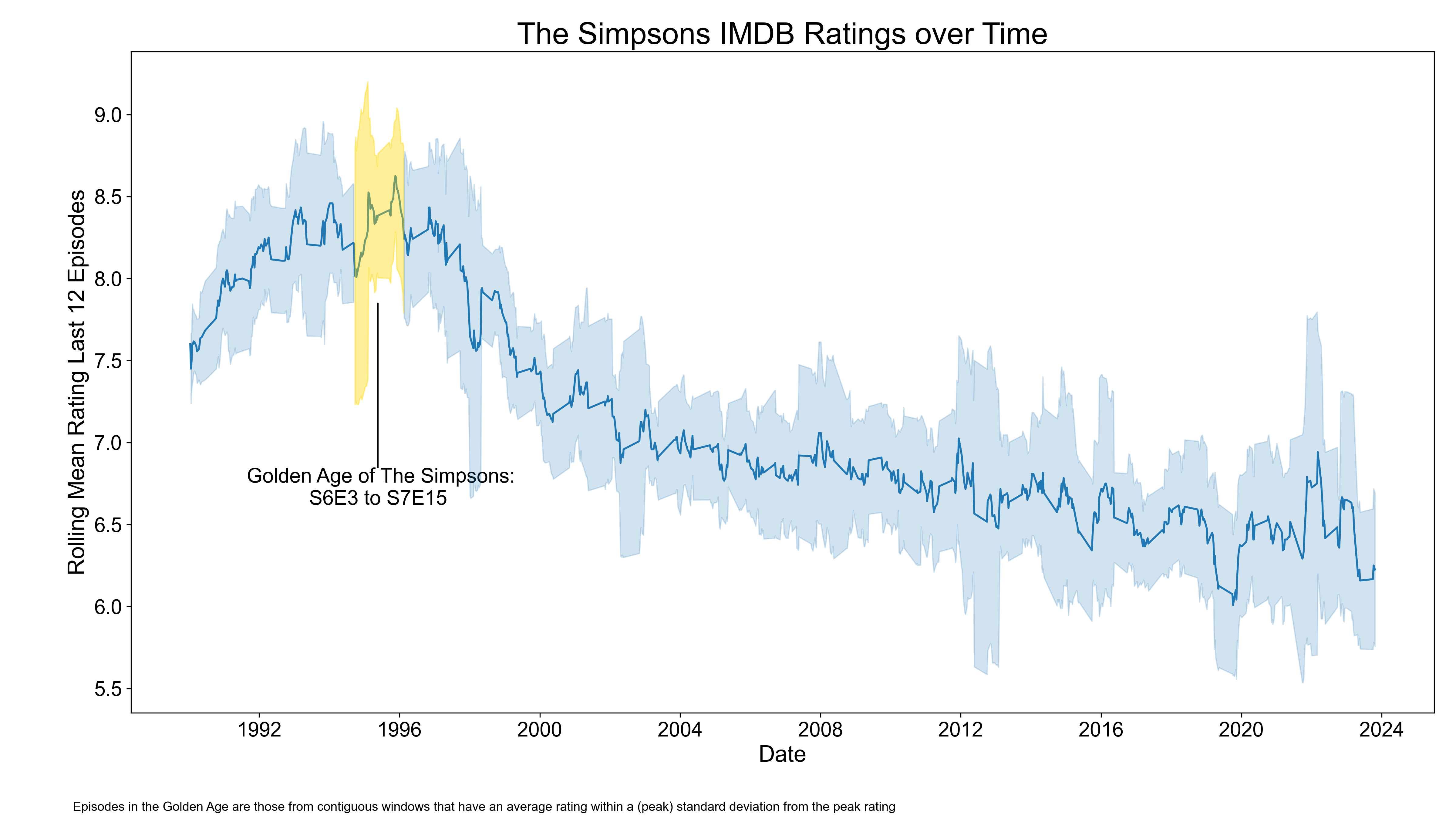
To determine the golden age of The Simpsons I came up with the following criteria: all continuously connected episodes that belong to a rolling 12 episode window where the rolling mean rating is within one (peak) standard deviation of the peak rolling mean rating. Under this criteria the golden age of The Simpsons runs from S6E3 to S7E15.
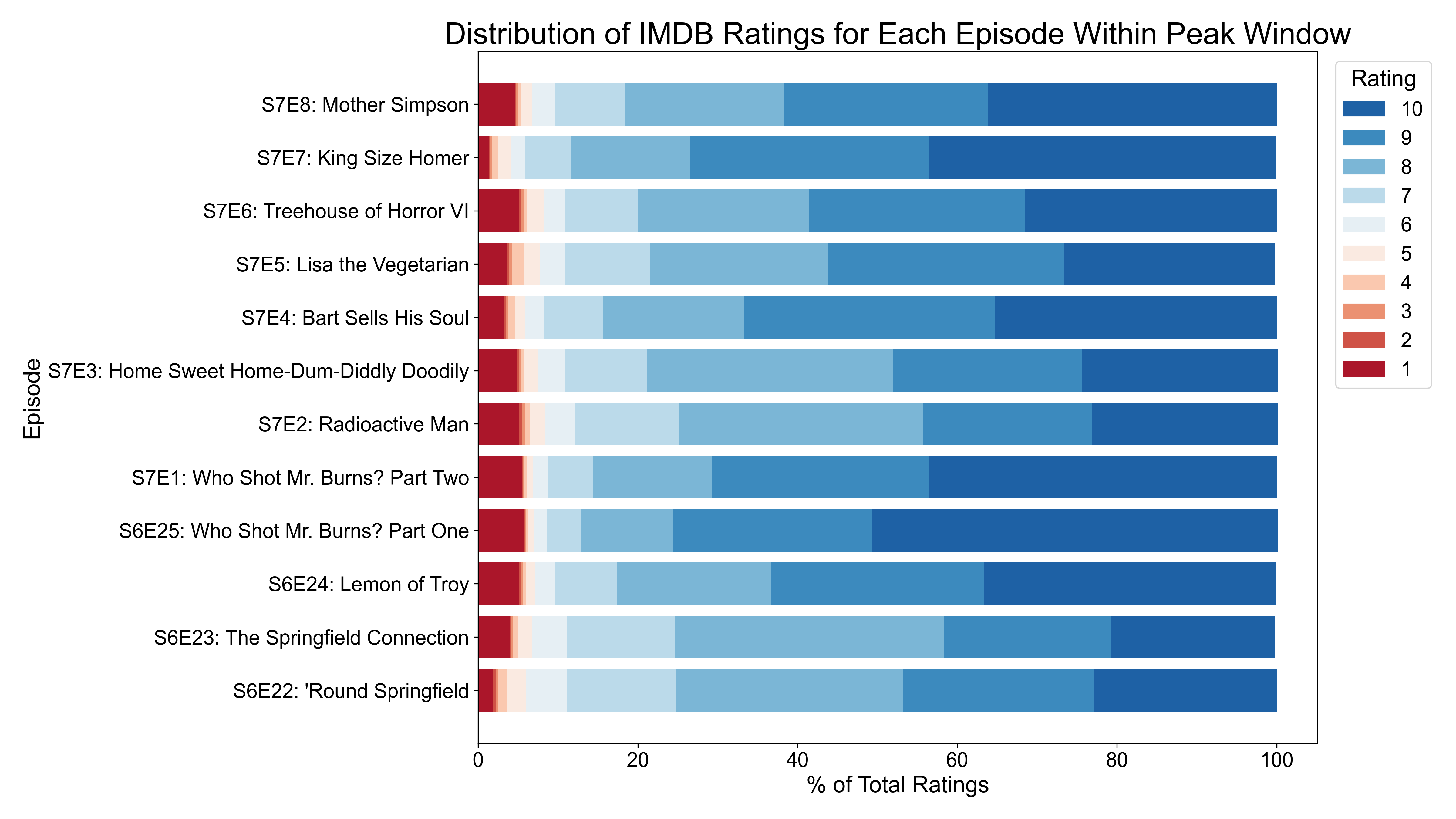
The rating distributions for the episodes in the peak windows is shown in the stacked barplot figure above. Here we are looking at each episode in the peak window on the y-axis and on the x-axis we are looking at the percentage share of user ratings for each rating level for that episode. The colour scheme for the ratings is indicated in the legend.
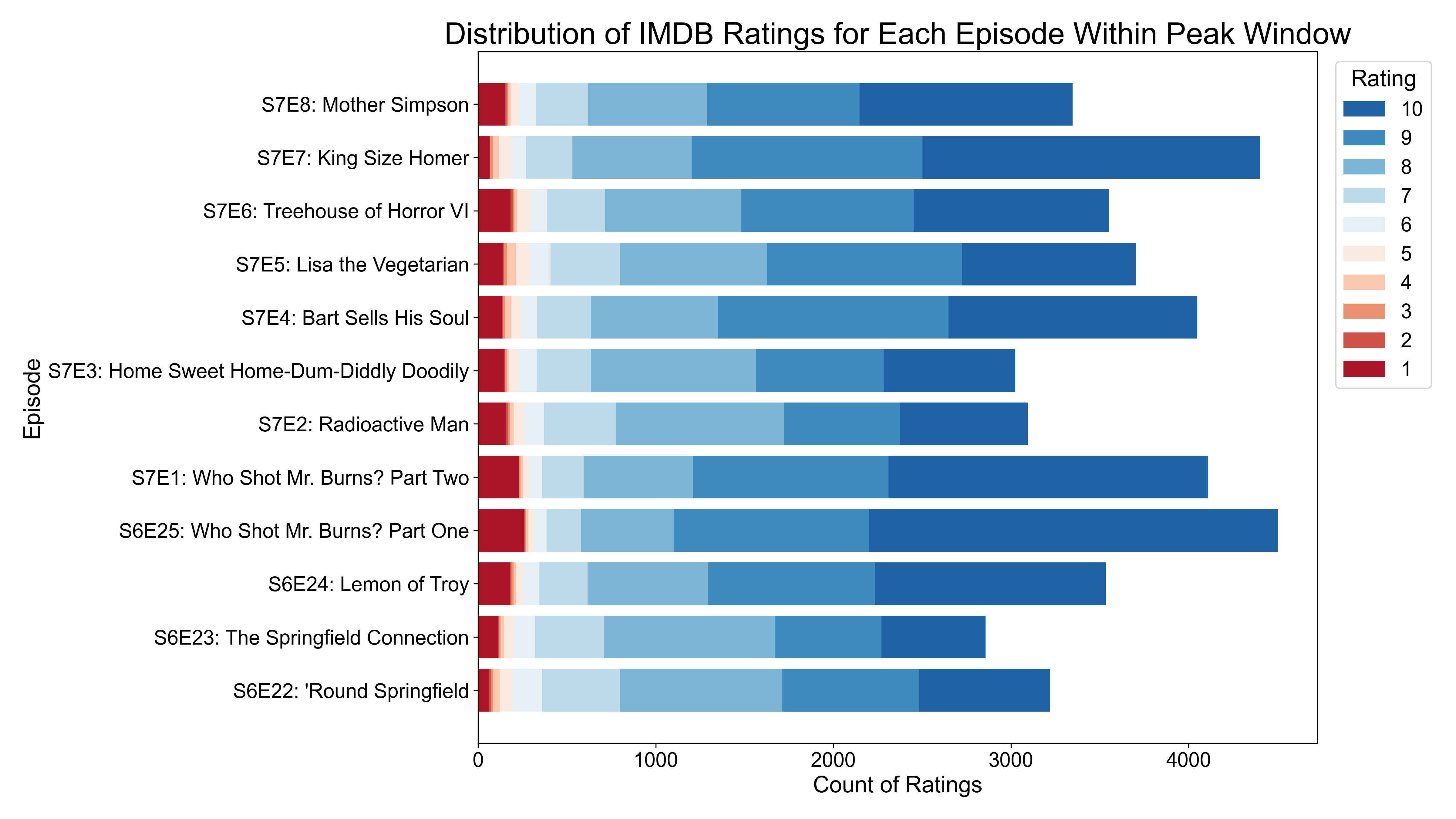
Similarly, for the figure above we are looking at a stacked bar plot showing the counts of each rating for each of the episodes within the peak window.
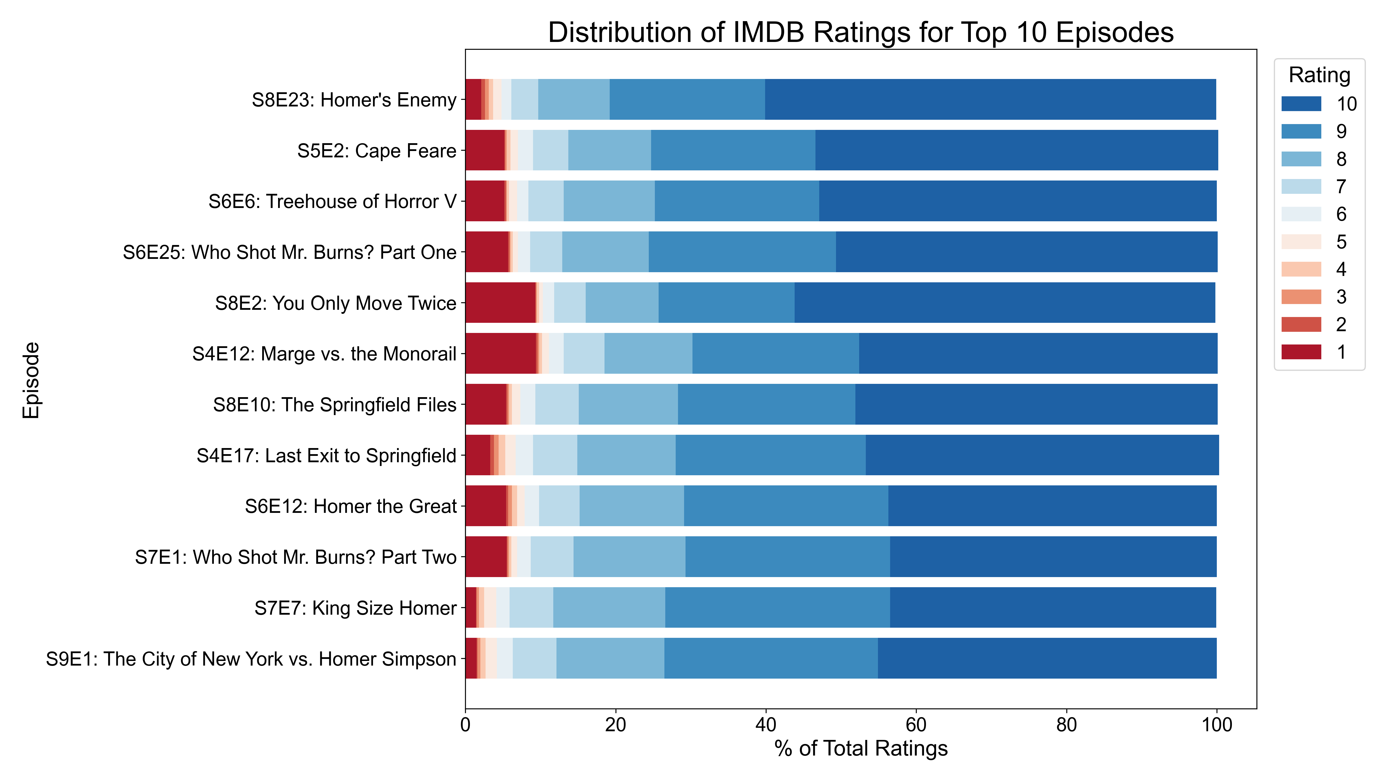
As well as the peak window of the show based on the rolling 12 episode windows we can also look at the individually best rated episodes. Above are the percentage share of each rating level for the highest ranked episodes of the TV shows. There are 12 episodes that have a rating of 9 or above. The episodes are ordered starting from the highest ranked at the top of the y-axis. The top rated episode is S8E23 "Homer's Enemy" AKA the Frank Grimes episode, which is the only episode with a rating of 9.3ß.
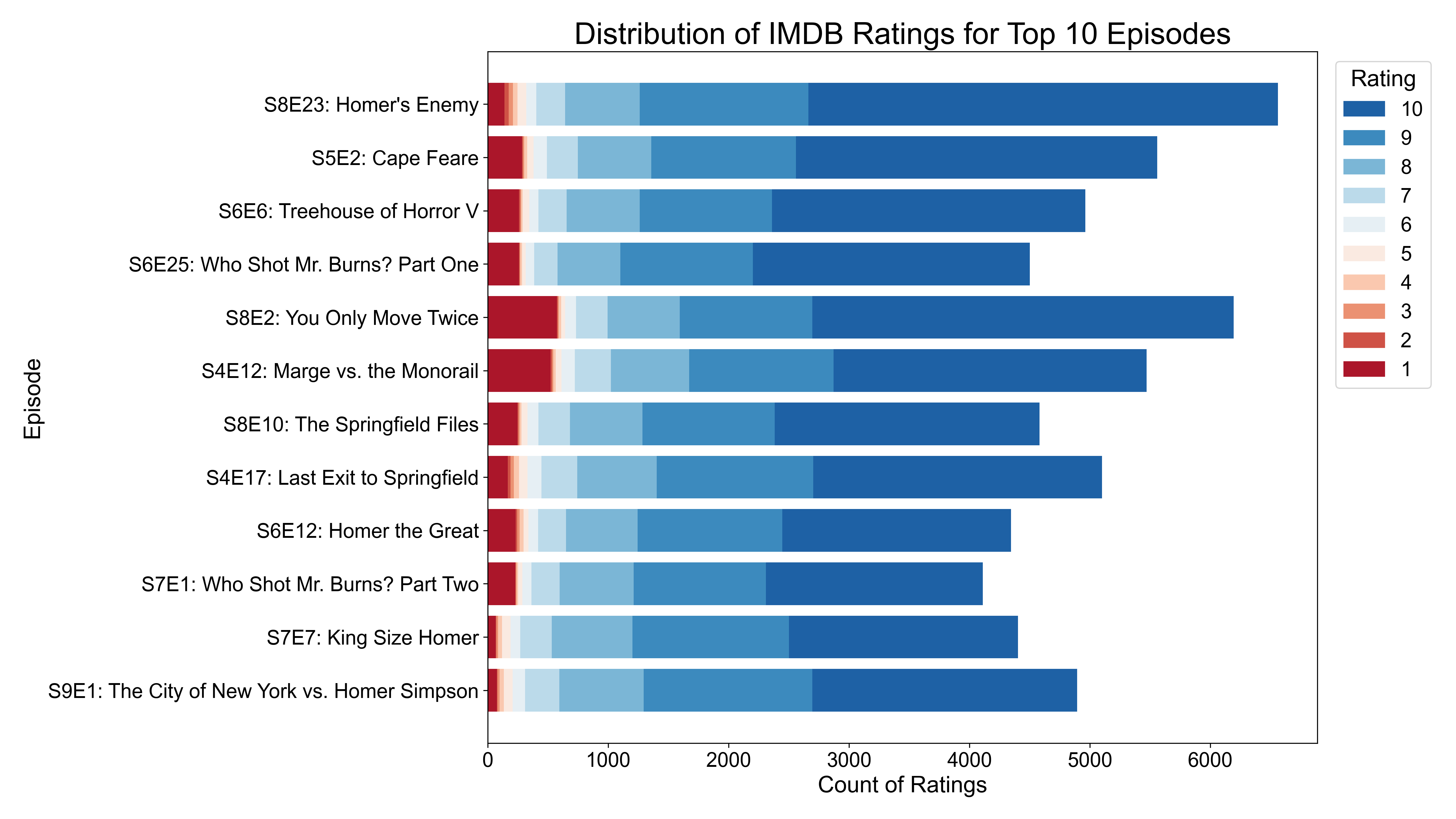
And the corresponding counts for each of the top 12 episodes is shown above.
If you are interested in seeing how this was done the code for this project is available on my GitHub here